VACF Responsive Web Redesign
A Non-Profit UX/UI Case Study.
Project Overview
VACF (Vietnamese-American Cancer Foundation) was designed to connect the Vietnamese community of Orange County with resources related to cancer education, research, advocacy, and services. VACF helps Vietnamese cancer patients and their families with psycho-social support, while addressing their unique culture and beliefs.
Problem
We have observed that the navigation and design of vacf.org isn't meeting the standards of accessibility for elderly native Vietnamese speakers and the surrounding Vietnamese community. Ultimately, the site is visually overwhelming, and fails to properly inform viewers of cancer information, events, and screenings of VACF. This problem statement led us to frame the question:
How might we improve the overall website design so that users are successfully able to schedule a breast cancer screening appointment?
Our Redesigned
High Fidelity Prototype
The re-design of the non-profit organization VACF (Vietnamese American Cancer Foundation) improved on accessibility, and the usability of the service website. The final version of this redesign prototype focused on a clean, yet professional color palette. It provides an approachable outlook for a difficult topic like cancer.
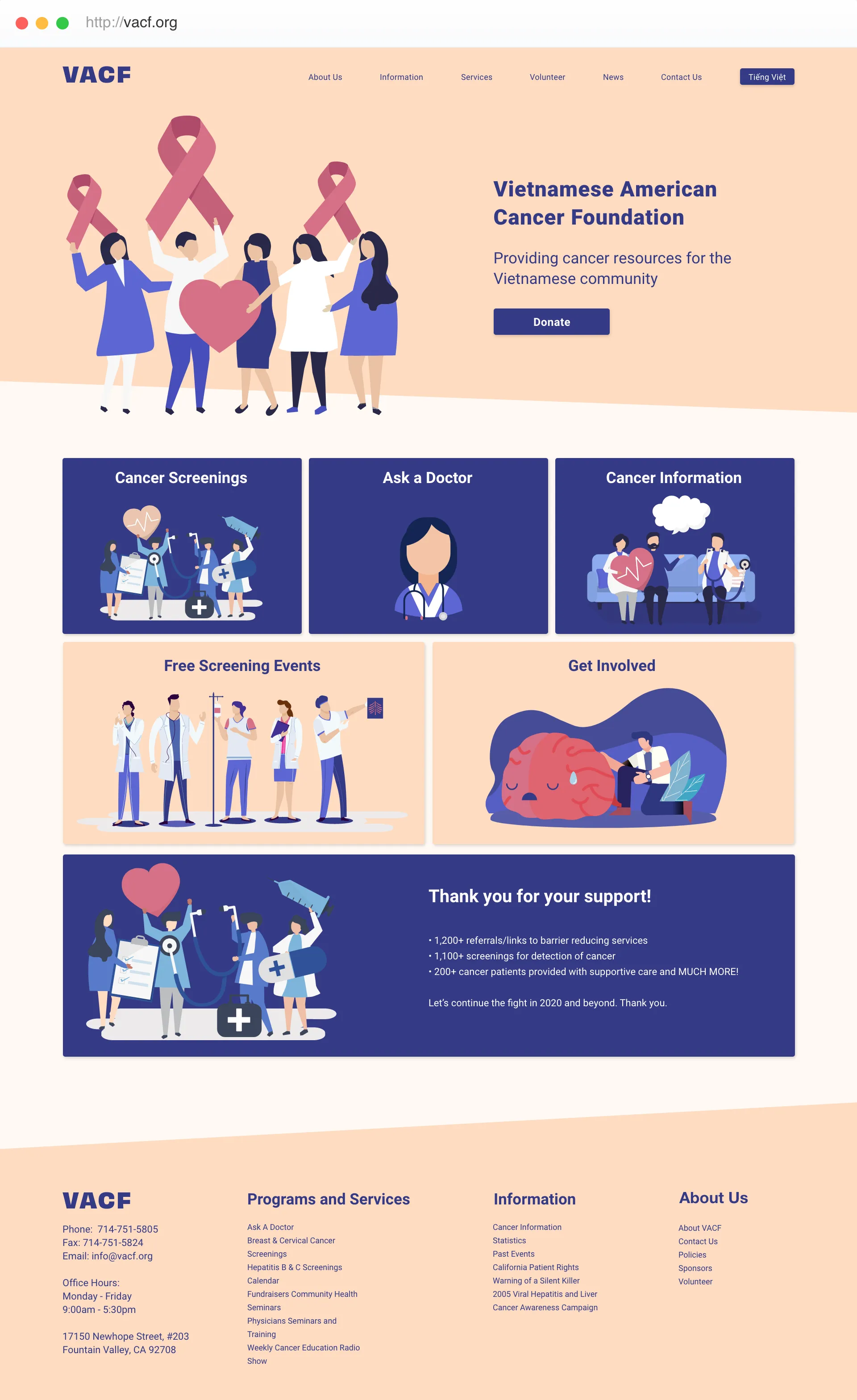
High fidelity Prototype of VACF
Redesigning the old website
- The overall website has a very outdated look with too many different graphics, making it look cluttered.
- The top left logo is too large, with unnecessary components
- Our group decided to keep the "Donate" call-to-action button
- The website had a fixed width - making it non-responsive. We wanted to include responsive design into our design process.
- Random graphics and videos contributed to the outdated design and feel

Current outdated site for VACF
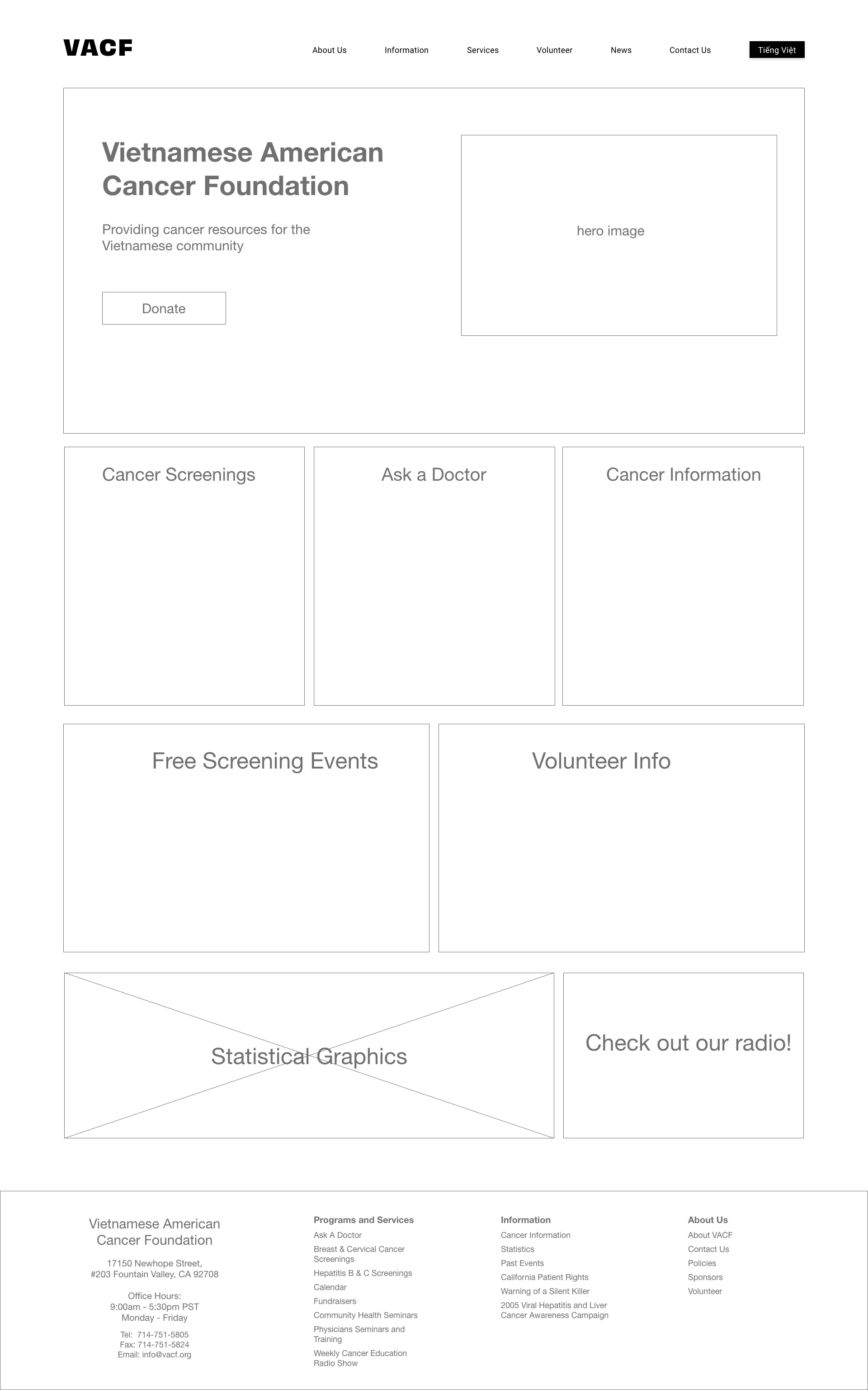
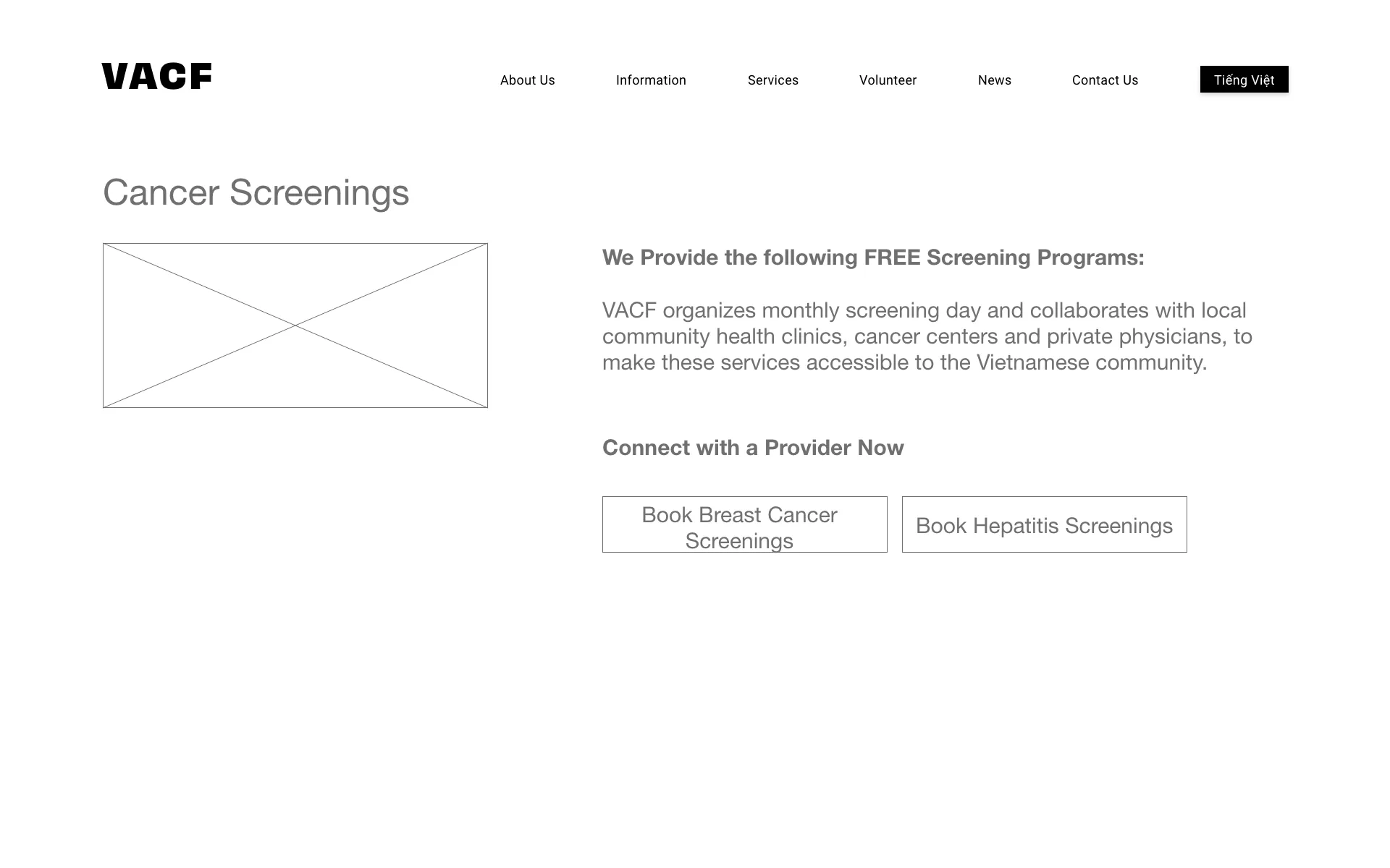
Low Fidelity Prototypes
Style Guide
Peach
Light Peach
Dark Purple
Deep Blue Purple
Purple
Medium Purple
Rose
Pink Rose
Redesigning the Eligibility Screen
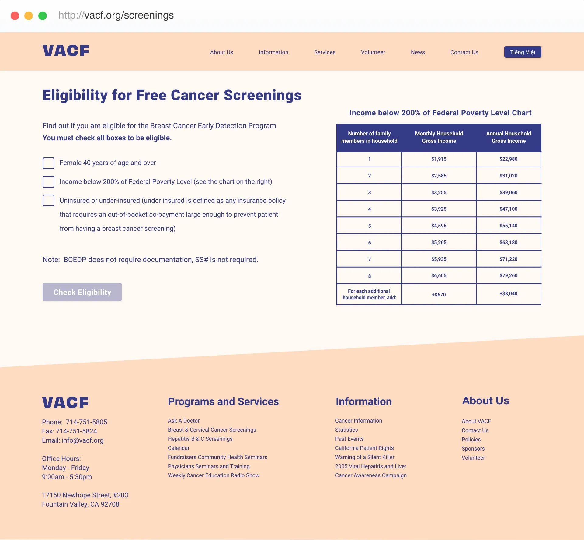
This screen helps determine if the patient is eligible for free cancer screenings. The old website did not incorporate a booking process, so we wanted to incorporate the booking process within their website platform. The challenge we faced was: how do we validate all three requirements before a user books an appointment. We solved this by disabling the "check eligibility" button until all the requirement boxes have been checked (as seen in the image). Once the user verifies and checks all three boxes, it will allow the user to book an appointment.
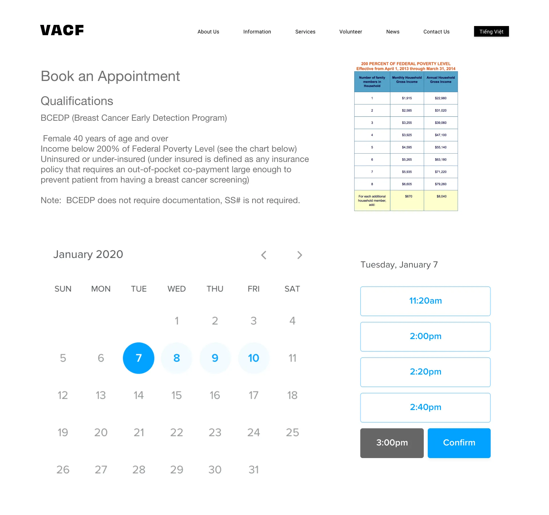
Designing the Appointment Booking
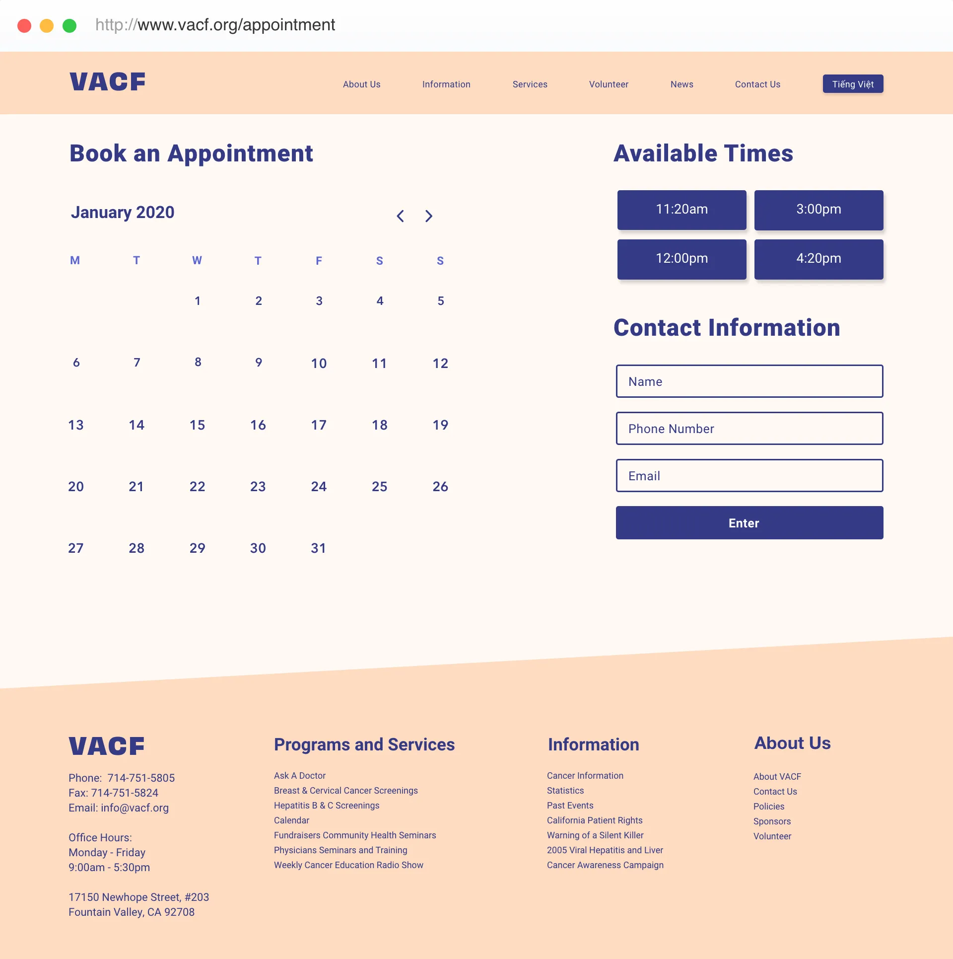
Booking Interface
It was important to keep the booking system as simple as possible. We kept in mind that most of our users may be elderly so we designed this effortless interface.
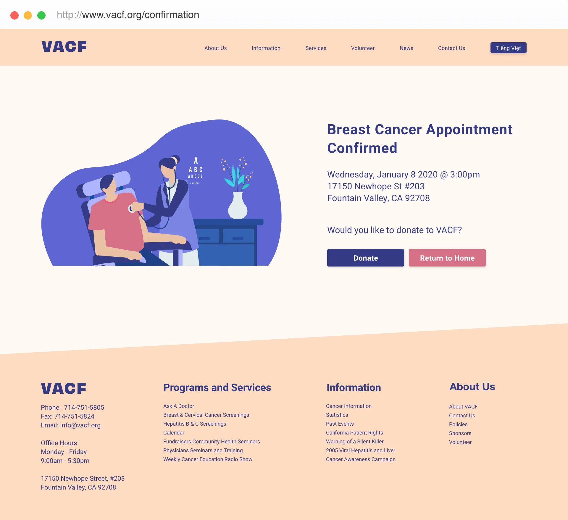
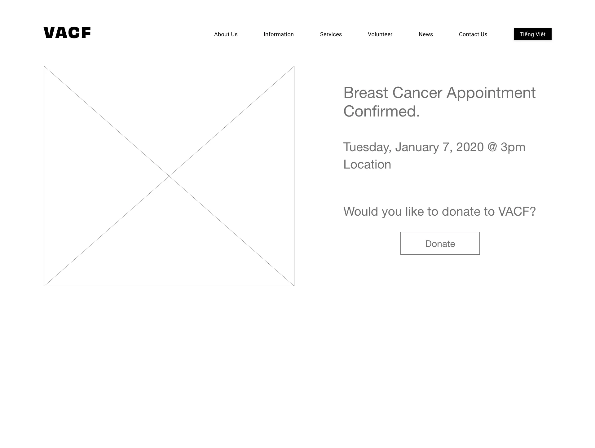
Confirmation Screen
We incorporated the donation button with the appointment confirmation screen. A patient undergoing free cancer screenings is more likely to donate.
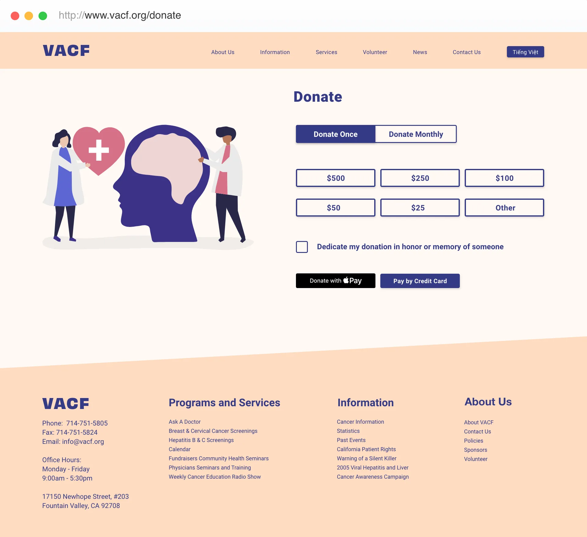
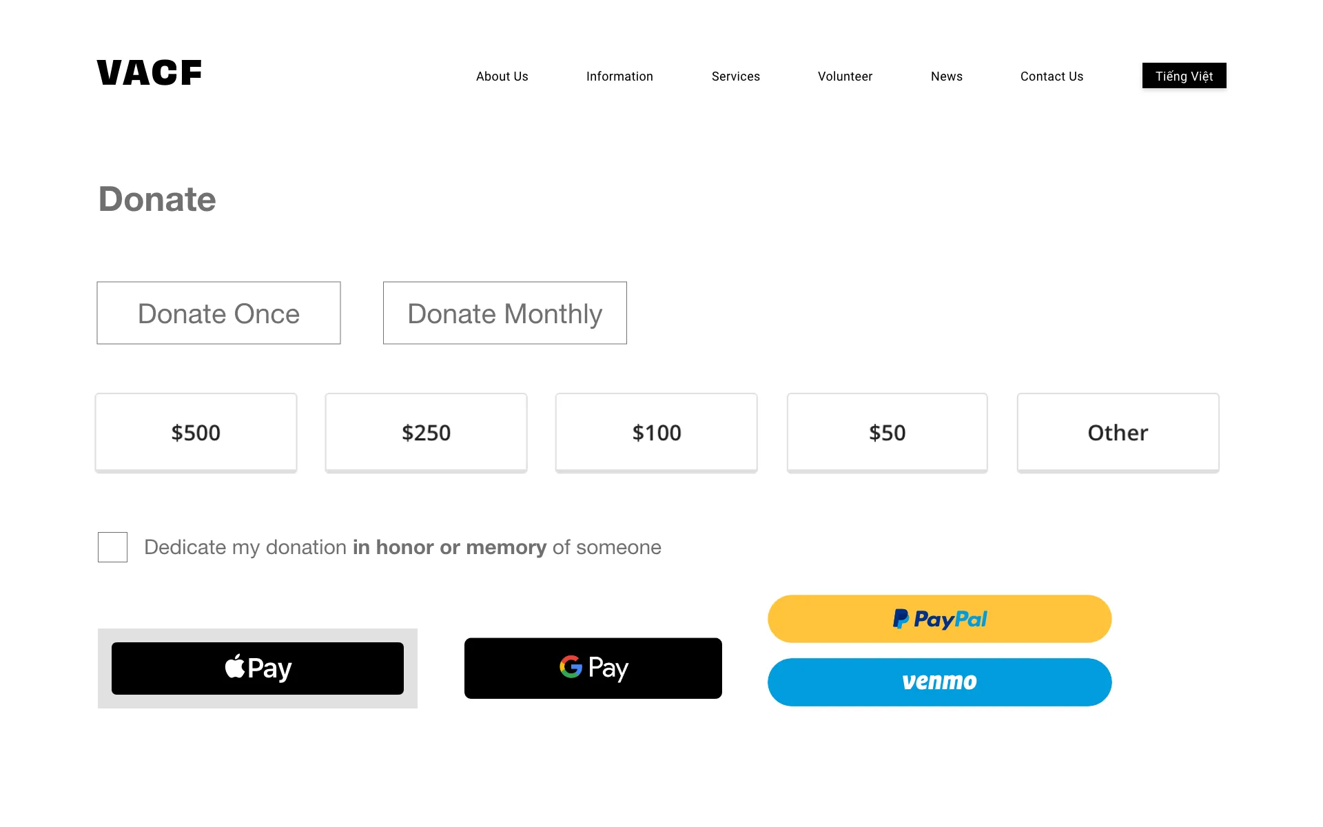
Donation Screen
The donation screen allows the user to donate with ease using Apple Pay or by credit card. We found that people are more inclined to donate if we allowed them to dedicate their donation in honor or memory of someone. This is especially since a lot of the users and their family members entering the site are affected by cancer.
Key Takeaways
- Better organization of information: Information was reorganized and now makes the most visited parts of the site easier to find, all while simultaneously, keeping the organization's ability to solicit donations and promote events.
- Better user flows: User flows for signing up for screenings and donations were improved. The site now properly verifies their eligibility for free cancer screenings, before booking an appointment.
- Rebranding: A new brand was created to give the VACF a stronger voice. The color palette consists of warm colors, a new simplified logo, and a series of friendly illustrations to give the site a more welcoming feel
- Mobile first approach: The new site was designed with mobile devices as the primary platform for navigation
- Higher donations: Users are more inclined to donate with the new "dedicate my donation in honor or memory of someone" button. This definitely would boost and motivate donations.
Plans for Future Iterations
- Convert the website fully to Vietnamese: This will cater to the majority of users that speak Vietnamese only.
- Complete the mobile user flow for cancer screenings: Condensing the text-heavy information on the cancer screening page for mobile devices will pose a small challenge. Checking their eligibility should probably span multiple pages.
- More user tests on mobile: Due to the short timeframe, we weren't able to test many users with our mobile site. Despite using the mobile-first approach, we wanted to ensure the desktop was fully usable.